← All work2025HospitalityLisbon

Tidewell

Identity, wayfinding and booking experience

Nine coastal properties that behaved like nine businesses, given one identity, one signage system and a booking flow that stopped losing people at the map.

Client
Tidewell Coastal Houses
Year
2025
Sector
Hospitality
Scope
Identity, wayfinding, website, booking flow
Duration
26 weeks
Team
6 from the studio

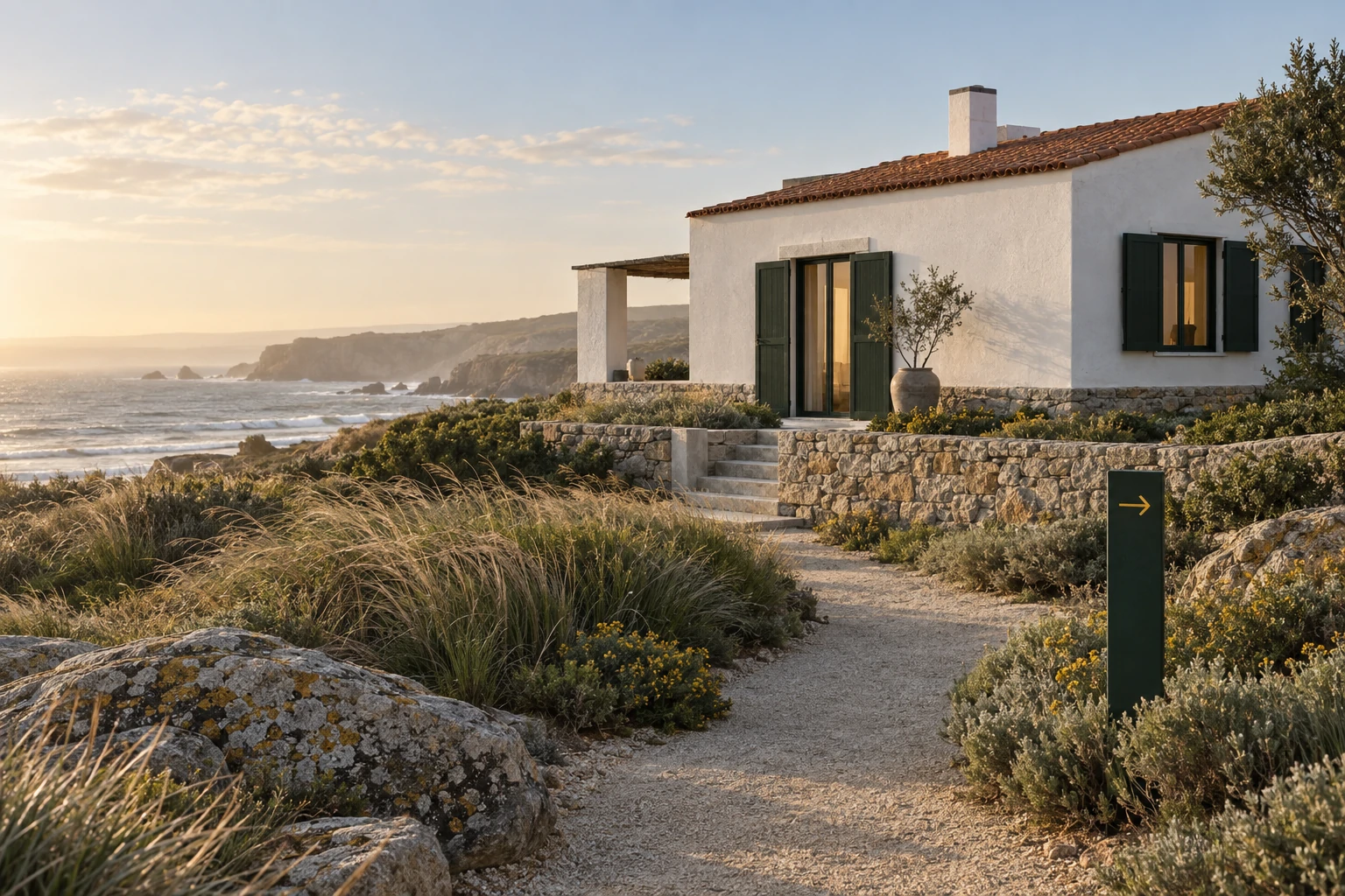
Tidewell owns nine small properties along 200km of Atlantic coast. Each had its own logo, its own signage, its own booking page and — the expensive part — its own returning guests who had no idea the other eight existed. The job was to make one brand out of nine without flattening what made each house worth the drive.

01 — The problem

Nine brands competing for the same guest

Tidewell's guests were loyal to a house, not to Tidewell. 71% of returning bookings went to the same property the guest had already stayed in, and almost none crossed to a second. The group was paying nine marketing bills to reach one audience.

The booking flow made it worse. Guests picked a property first and dates second, so a full house read as 'no availability' rather than 'three houses free that weekend, forty minutes apart'.
02 — The thinking

Sell the coast, then the house

We inverted the model. Tidewell became the coast — a stretch, a drive, a set of nine stops — and each house became a chapter of it rather than a competitor to it. The identity is a coastline: a continuous rule that runs through every touchpoint and swells at nine fixed points.

The booking flow inverted with it. Dates come first, the whole coast responds, and unavailability turns into a recommendation instead of a dead end.

The sign family — vitreous enamel on steel

03 — The making

A signage kit that survives salt

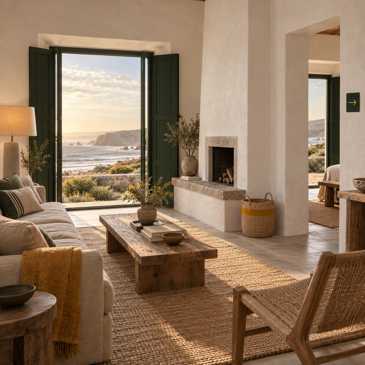
Every house shares one signage kit: three sign types, two inks, one typeface, powder-coated marine aluminium. The house's own character comes from a single assigned pigment and a commissioned pattern, not from a different logo.

On the site, each house keeps its own colour world and its own photography rhythm, but the frame around them never changes. Guests learn the frame once and read all nine fluently.

Nine houses, nine pigments, one frame

04 — The result

Guests started collecting houses

Cross-property booking became the growth story: guests who had stayed at one house started treating the remaining eight as a set. The group retired eight marketing budgets and put the saving into the coast itself.

Behind the decisions

What we chose, and what we argued against.

Why keep nine colour worlds

Total consistency would have erased the reason guests loved a specific house. The frame unifies; the pigment inside it stays local.

Why dates before place

The old flow asked guests to choose the thing they were least sure about first. Reversing the two questions turned every sold-out weekend into a cross-sell.

What we removed

The loyalty programme. It rewarded the behaviour we were trying to change — repeat stays at a single house.

Selected artefacts

From the work itself.

Outcome

What changed.

9 → 1

Brands to manage

Eight local marketing budgets retired.

2.4×

Cross-property bookings

Guests booking a second house within a year.

3

Sign types, total

Down from 27 across the group.

We asked for a logo that would work on nine buildings. What we got was a reason for guests to visit the other eight.
Rui MendesFounder, Tidewell

Credits

Who made it.

Strategy & naming

Owen Mbeki

Identity & wayfinding

Júlia Ferreira, Hana Okada

Product & build

Teo Marchetti, Priya Raman

Start a project

Have something like this in front of you?

A 45-minute call with the people who would do the work. If we are not right for it, we will say so and suggest who is.