← All work2026Beauty & skincareOslo

Fjordlys

Brand identity and packaging system

A cold-water skincare range rebuilt around a single, provable idea — and a packaging system that survives a wet shelf.

Client
Fjordlys Skin
Year
2026
Sector
Beauty & skincare
Scope
Strategy, identity, packaging, launch campaign
Duration
19 weeks
Team
5 from the studio, 3 client-side

Fjordlys had a laboratory's credibility and a gift shop's shelf presence. Eleven products, four unrelated bottle systems and a name most customers pronounced wrong. We rebuilt the brand around the one thing competitors could not copy — a cold-water extraction process with published results — and designed a packaging system that made that process visible from two metres away.

01 — The problem

A serious product wearing a souvenir's clothes

Fjordlys sold well in pharmacies and badly everywhere else. In a pharmacy, staff explained the cold-water extraction and customers bought it. On an unattended shelf — department stores, hotel retail, their own site — the range lost to brands with a tenth of the science and ten times the clarity.

The diagnosis was not a logo problem. Four separate bottle systems had been added product by product over six years. Nothing on the outside of any of them said what the inside actually did differently.
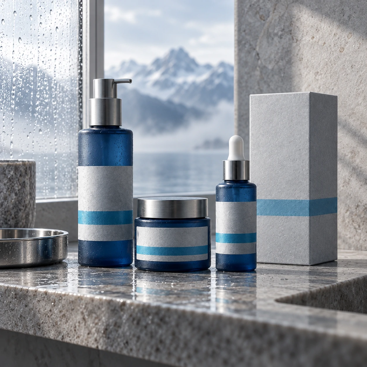
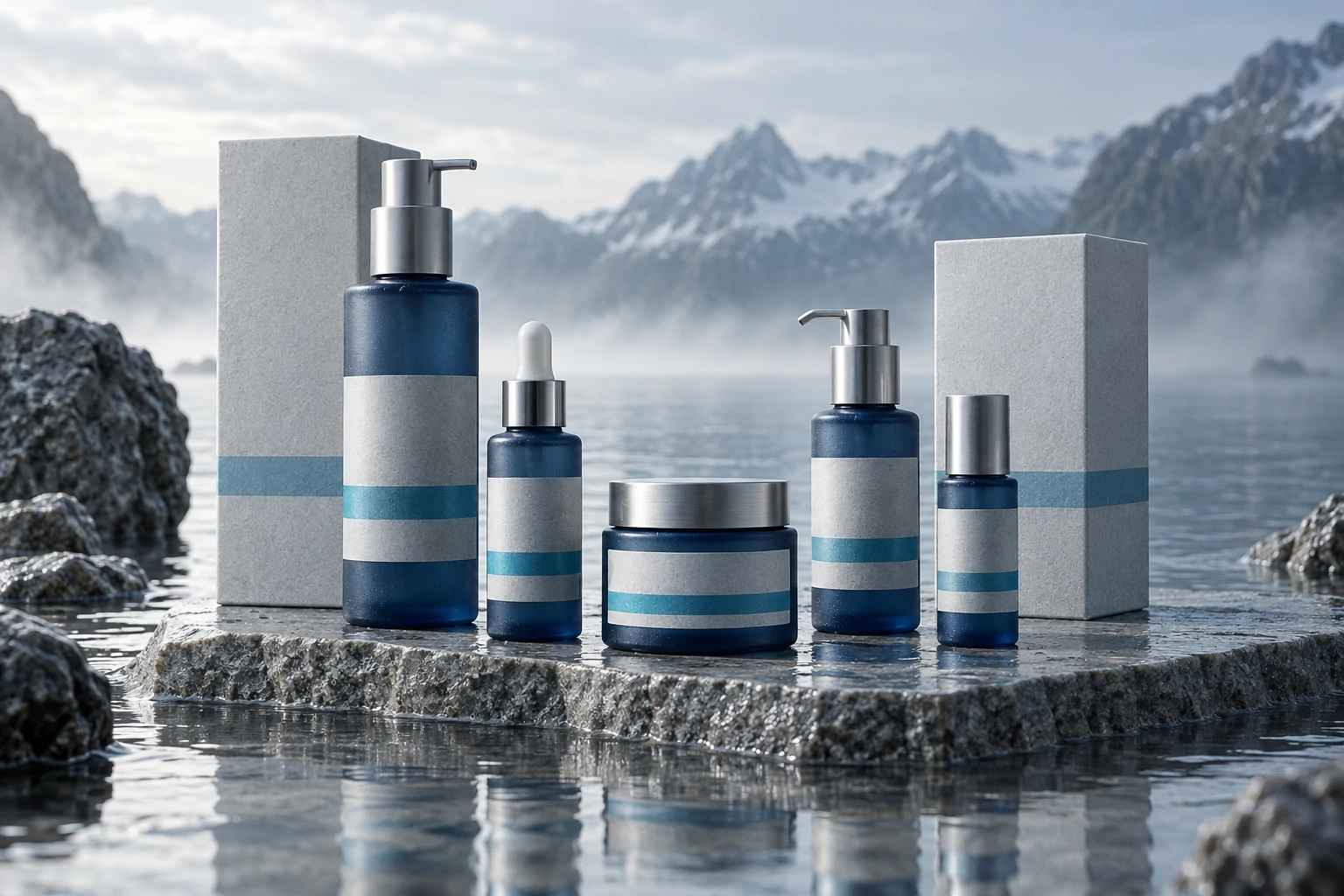
Audit — eleven products, four unrelated systems

02 — The thinking

Print the proof on the package

We stopped treating the extraction process as a technical footnote and made it the identity. Every Fjordlys product now carries its extraction temperature and depth as a typographic mark — 4°C, 30m — set in the same position, at the same size, on every single unit.

That decision did the work three other decisions would have. It created a recognisable shelf pattern, it gave the range a rational order, and it made the claim checkable, which is the only kind of claim a sceptical customer believes.

The extraction mark — fixed position across all eleven units

03 — The making

One bottle, four volumes, no exceptions

We reduced four bottle systems to one silhouette in four volumes, then let colour carry the range. Each product family prints in two inks that overlap on the label — the overlap is the family's colour, so a customer reading the shelf sees three groups before reading a single word.

The labels are printed on uncoated stock with a water-resistant varnish only where the type sits. Wet hands smear a fully coated label; they cannot smear this one. That detail came from watching eight people use the products in their own bathrooms, not from a brand workshop.

Front of pack — wordmark, product, volume, regulatory panel

04 — The result

Legible at two metres, defensible at two centimetres

The range launched across 340 unattended retail doors without staff explanation for the first time. The extraction mark became the thing customers photographed, which gave the launch campaign its whole art direction for free.

Behind the decisions

What we chose, and what we argued against.

Why not a new name

Mispronunciation was the loudest complaint and the cheapest to fix — a pronunciation line under the wordmark solved it without discarding six years of pharmacy trust.

Why two inks, not full colour

Two-ink printing kept unit cost inside the existing packaging budget and produced a shelf pattern full-colour photography could never hold at distance.

What we argued against

The client wanted a fifth 'premium' bottle for the flagship serum. A single silhouette was the point; we priced the flagship higher and left the bottle alone.

Selected artefacts

From the work itself.

Outcome

What changed.

340

Unattended retail doors

First distribution without in-store explanation.

4 → 1

Bottle systems

Eleven products on one silhouette in four volumes.

19 wks

Strategy to first press run

Including two rounds of in-home testing.

They talked us out of the thing we asked for and into the thing we needed. Our chemists now explain the brand better than our marketers do.
Ingrid SolheimManaging Director, Fjordlys Skin

Credits

Who made it.

Strategy

Nadia Brandt, Owen Mbeki

Identity & packaging

Júlia Ferreira, Sam Okonjo

Production

Petra Lindqvist

Start a project

Have something like this in front of you?

A 45-minute call with the people who would do the work. If we are not right for it, we will say so and suggest who is.